Tuesday, 18 February 2014

Branding

Branding


Below are drawings of a few of my favorite pieces, the blue George Nelson block clock. The designer was trying to translate functional properties with utilitarian objects. The Block clocks represents high quality reproduction in the style of the original clock. Nelson used:

  • pure colour
  • bold graphic forms
  • modern materials
  • simple
  • good looking


The "Crying girl 1963" I only drew the eye not the full picture,  as during the 1950's and 1960's a majority of american artists began to adapt the imagery of motifs of comic strips. Lichtenstein made comic strips in 1958. 


Existing Logos Research

My logo is actually coming on leaps and bounds but making a brand is not just about your company. Research is also vital, I looked into a few brands such as Mercedes, McDonalds, and Nike. Back in the day logos were a mark or symbol to showcase the product. They are the same thing today but with a few changes, the modern day logo is a bit more flexible and adaptable to any type of media. 
The Nike logo "swoosh or tick" was intended to look like the wigs of the Greek goddess of victory. 
Other dominating logos include
  • Google
  • Adidas
  • apple
  • channel
  • virgin

"YAKI NOODLE" 
This page shows the different colours of which my logo could take,  I actually didn't go with any of these, eventually I went with a red and orange logo. 


 The colours used are shown above, for the Brand Guidelines you had to show the CMYK the percentage the colour is. Doing this allows another to find the exact colour you used to make the logo if they were to make the company.


Reflection: 
How did you get on with your given task/s?
The branding project was really fun and to this day was the best project, I think because it was totally graphic based it meant I had to go back relearn new skills which was enjoyable. It was also challenging because of the timescale we had 2 weeks to come up with  a new brand, and this wasn't easy. I was really pushed to my limits.  Branding my favorite food meant I traveled all over London to different restaurants and markets testing out the food and asking locals questions.  Designing a logo for the food you are highly passionate for was great and spurred me to on to design loads. 

When and how did you learn this and how will you further use these thoughts in future work? 
Branding is all about making an iconic company almost, For the final project may be branding might come in, meaning designing logos or posters.  The graphics project really made me think about presentation and how things are set out, because we had to make menu etc. 

What aspects of your work were you not happy with and why is this? 
I had one initial idea that got really good positive feedback from class mates in crits and I decided not to use it, and  looking back I don't know why I didn't.  I was fun, new, and modern.

Overall 8/10 for the crossover project.


This is me with my YAKI NOODLE T-SHIRT, using a online t shirt designer applied the logo and the text on the back, and got it printed. 


Branding

Graphics Branding Project

Aims: To explore and develop an understanding of identity design/branding.

A brand is the name given to the term, design or symbol, or any feature that identifies ones sellers's product distinctively against others from those of sellers.

Street food is ready-to-eat food or drink sold in a street or other public place, such as a market or fair, by a hawker or vendor, often from a portable stall. 
Markets in London are:

  • Borough Market
  • Broadway Market -Hackney 
  • Berwick Street market
  • Whitecross Market - Barbican

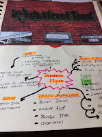
     To start the thinking process coming up with the food is the first step, for this I went with what I personally like to eat which is Wagamama and Japansease food. So going with this listing all things Japansease.

    • Bullet train
    • strong cultural background
    • religion
    • Bonsai Tree
    • Mount Fuji
    • chop sticks
    • green tea
    • Sake rice 
    • largest population in cities
    A USP? 
    is what one wants the company to have:
    - sustainable packaging and healthy ingredients.

    Target Market - Who's the food aimed at?
    • All people in General
    Fonts- I decided to do a couple of pages on fonts using Illustrator. Branding involves creating a logo so these fonts are experimentation of Typography which could be used for the logo title.


    As my food is Japanease I thought it would be a good idea to have some Japanease text and the page below showcases my work. Each is a word with a different meaning like spirit, or love or mountain etc.


    The Logo 


    These are all me playing around with Ideas for a Logo, I did quite a few as it gives one  a bigger scope to choose from when it comes to actually deciding upon one. Some of them stick closely to the culture of Japan and some do not. Others are there for comical reasons like the bowl of noodles is basically what it says on the tin.  The first drawing I did was the one on the top left the picture above of the Mount Fuji with the red sun.  Japan does have a nickname - "Land of the rising sun".
    The flag is simply a red circle. This design is still one of my favorites because its not over complicated.

    Food name?
    Katsu, yaki, udon, yakitori, and miso are all Japanease words that could be used amongst an English title.  I knew that Yaki meant fried or Grilled Food so I went with that. Yaki Food is my brand name.


    Final week Bottle Project

    Twitter 

    Following on from last week research wise twitter was the next stop, many famous celebrities and sportsmen and women often follow environmental agencies or charities. Knowing this finding tweets wasn't so hard, I  found tweets from Ian Somerhalder who runs a charity called ISF.   I found these tweets because they are sending a message just like my project will, well hopefully.  


    This one below hit a nerve, some of my initial ideas relate to this. In Bangladesh for example people work collecting scrap plastic as a job but they have hope that life will improve. Almost 50% of the total amount of food thrown away in the UK comes from our homes. We throw away 7 million tonnes of food and drink from our homes every year in the UK, andmore than half of this is food and drink we could have eaten.


    Saving the Coral Reef 

    The coral Reef is a protected site but plastic and human litter threaten this area.  Coral reefs have survived tens of thousands of years of natural change, but many of them may not be able to survive the havoc wrought by humankind.  The coral reef is under threat via Tourism, tourists visit the iconic waters but the petrol and propellers sometimes catch the reef destroying the natural habitat.  From this I decided to design  a product that protects the Reef . 


    Flow diagram of my Making process 


    To make the structure I used a thick wire that's easy to bend using your hands. I shaped the metal round a shampoo bottle, I did this for 6 times.  The metal is only there to be a support to the recycled plastic coating/ roof that will be on top. The recycled plastic roof serves as a message saying this please help protect this environment. 
     This is the structure, to join them a thin green wire or garden wire was attached round each piece, I did this twice one for each side.  Then because it kept moving I had to use sticky tape and Play do.  Obviously this is not the finished model I am still making it now. I hope to Photoshop it onto the coral Reef.   Just as an example I put cling film on it. 


    Evaluation 
    What went wrong ?
    I think my initial ideas were good but very hard to portray in a model, I did try and recreate them but it just looked wrong. 
    What went well ?
    In this project it was really directed to what I feel strongly about, from looking at the art instillation's on the internet for example the fishes on Rio beach I was driven to do a piece not so much product but a fine art piece. Knowing this i looked into many art pieces that had a message to them. 


    Friday, 14 February 2014

    PLASTIC BOTTLE PROJECT second week

    The second week aim  was to finish all research to do with the given material or building. Personally for me my research extended this date as  I was struggling to decide upon a product to make or to design. I found myself going very deep into my research and may be getting a bit tangled.  My research really started off at basics I was asking myself questions like how could get the best results out of the material. Each plastic has different uses the main plastic that we use is PET and is used for drinks, water bottles, because of its high resistance to acids. Meaning the plastic does not react. Knowing what your working with is very important as melting certain plastics can be very dangerous if not done in the right situation. 
     These pages are spider diagrams both done on "solving global warming" and the "effects of global warming". For me spider diagrams are a great creative way to get a point across without a essay of writing. 

    By doing these pages I was refreshing myself on on the harsh effects global warming is having on our environment. It allowed me to explore what humans are doing to aid the cause. 

    What I found hard? was scale down my research plastics and global warming have so much in common. Trying to get my research to the point that I could use it and understand it.

    What i Enjoyed? Because of the material given to me the brief was so wide which allowed me to explore in detail. I was able to link my research  to what I think is important such as environmental messages installed into art instillation. 
    Global warming booklet?
    This three page booklet is a simple guide to "going green" and what we can do to combat global warming. What really made me think is how the topic of global warming is forgotten about, while sea levels rise nothing to prevent that is being done on a large enough scale. 

    The "Go green" is a symbol of combating and doing your bit, from recycling, to turning off light switches and stopping the water slow while brushing your teeth. 

     Initial Ideas 

    All sorts were going through my head when it came to initial ideas may be too many to be honest luckily I go them down on paper.  I decided on doing a more sculptural piece rather than designing a product of such.  I wanted to portray messages in my art that relate to environmental matters. 
    • some people feel no need to connect with people they don't know or with the outer world, they shy away from the bigger picture, leaving them disconnected from whats really going on. 
    • bottle could be a symbol of containment
    • could include actual water
    • privileged/ non privileged 
    • glue gunning
    • water being precious
    • someones little world inside a bottle
    • bottle is a metaphor for separations of lives. 
    The bottle below was the idea of human hope the light at the end of the tunnel for people working 24/7 to fend for their families in poorer countries. I wanted to coat the bottle at the top with leaf Gold or golden paint to represent the hope that they strive for. Its also a message to the privileged that we really do have it easy, plus what we throw out ends up someplace else. The blue green colours represent the pile of rubbish that keeps expanding daily. 


    • The spiky design was my idea of using the glue gun to take apart different colour plastic to then put it all back together but in a more abstract form . 
    • The other one represents our marine life being killed off due to human participation. 


    Thursday, 6 February 2014

    Rapid Prototyping for Fun


    Recyclable Plastic Bottle Project week 1 research

    Plastic Bottle Project 
    The next following three weeks are slightly different than the other 2 week projects we have been given, we were each given a specific outcome related to our field ie product or architecture. The project aims to test our knowledge of expertise, processes and techniques used during the course so far. 
    First to  research into existing ideas and products, adding annotations at the same time. Annotations are basically analysis which is very important. 

    As soon as I was given the task of creating something using plastic bottles i think i was a little startled because it was different as im normally given  a product to design. This project allows for deeper research and the filed into which im researching it a lot larger. In a sense that's brilliant but sometimes it can be too much to deal with.  Furthermore what I immediately liked was the idea of having a project that concerns the environment and the future generations. 
    The coca cola picture was my idea, I started collecting plastic wrappers and changing the colour to green to represent the "go green". The 6'rs are also there,as these play an important role. 

    Research into controversial topics
    I liked and researched into this instillation.

    The Giant fish sculptures are jumping out of a beach in Rio De Janiero, and they're made from entirely plastic bottles. The actual scale of the sculpture was made by lining up hundreds of clear plastic bottles, giving the fish a shimmery scale effect.  The fish glitter with the reflection of the suns rays, juxtaposition against a beautiful backdrop of Rio. 
    Aside from the beautiful and surprising instillation on the beach, the plastic sculptures also symbolize the threat of over consumption on out ecosystem, especially on the marine life. Each the day the world consumes epic proportions with many being disposed on landfill.  

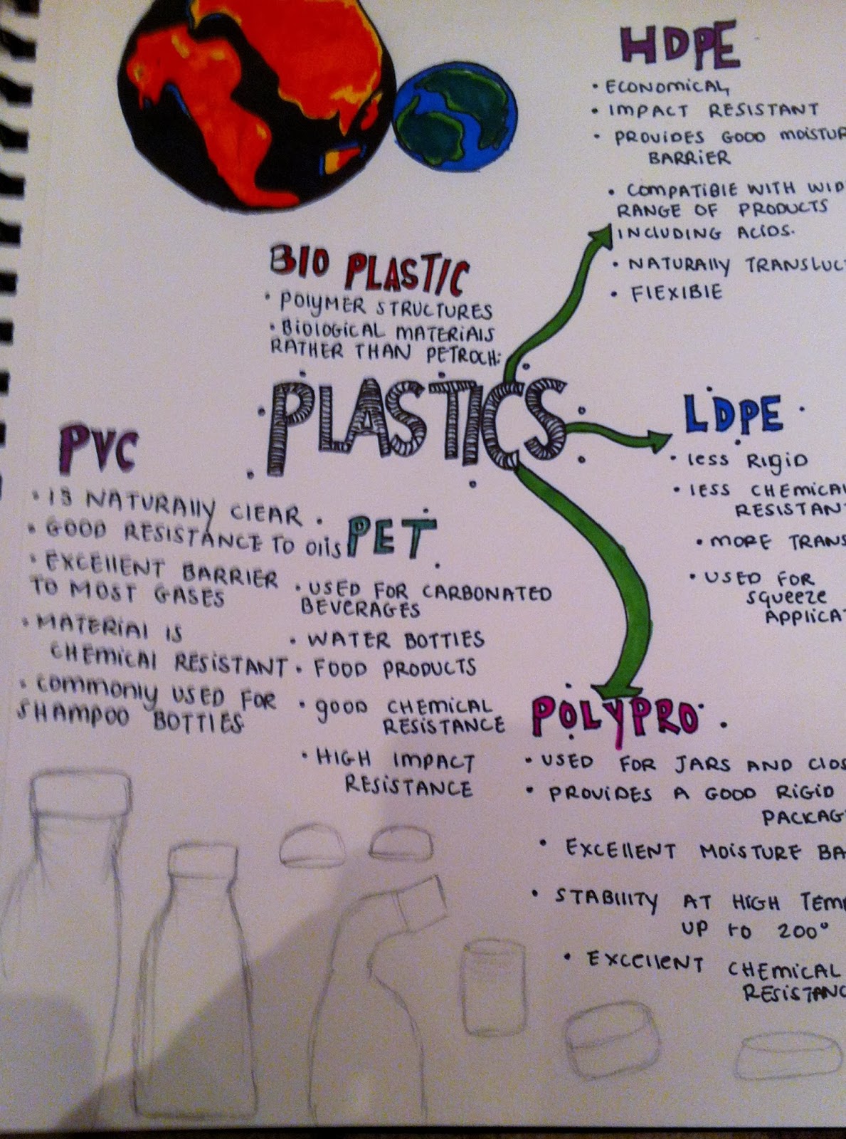
    This page again is research into existing plastics that we use on an everyday basis for example PET, PVC, HDPE, LDPE, and polypropylene. What I do need to look at is Bio Polymers in more detail. But for now more plastics we use are in some way shape or form chemically resistant. 
     
    HDPE CHARACTERISTICS:
    • impact resistance
    • flexible
    • good moisture barrier
    • naturally translucent What we forget about plastic and its capabilities is that liquid cant get in or out and this I hope to experiment with later on in the project.
    Book Research 
    "The eco living handbook and the eco design handbook" 
    I got these two out out of the library and looked at pages such as recycling, items that can be recycled and think green. 

    Evolution of my week

    I think the material I got given was a really interesting one, and a controversial one if that, plastic nowadays is evolving and changing. Geoff I think purposely gave me a wide brief allowing me to really experiment. 
    I have learnt over the past week that I should be more aware of the plastics I use and chuck out, one tends to ignore the problem, but one can do there bit. 
    The research stage I always find hard as my brief is so wide therefore I didn't nowhere to start. As a perfectionist I find it hard to do all this messy research it annoys me when it doesn't look right but this is only a minor difficulty for me. On the whole this week has been a great stepping stone.

    Inspirational Pictures 


    Monday, 3 February 2014

    Jewellery A2 pages and final pictures

    Initially the lizard was only in one colour due to the expense of acrylic, the design graphic shop in London luckily had some in stock. I did quite a few mock tests on cheap acrylic to see if the pattern came out ok, and if the hole for the wire was big enough. 


    Analysis 
    How did you get on with your given task/s? 
    I found the task and enjoyable one but quite stressful one too, but it was definitely worth the aggro using the laser. what i struggled with was the file on illustrator the animal pattern had to be put into the outer design and fit nicely in order for the laser to recognize it.  But this was sorted out and using the laser was an easy process. I had used it for many other projects to wasn't the first time.


    What feedback did you get from others (student and staff) - how did this feedback help the 
    development of your work? 
    Ellie was my client, She said at the end of the project how did you come up with the animal idea, I would say that's the only problem, I just went with an idea rather than doubting myself, therefore it was kinda a leaf of faith.  I did research thought and from that did realist animal jeweler is underestimated because of the animal used, so I just rolled with the idea. I think its quite attractive but quirky. 


    What have you learnt
     from the overall tasks? 
    Over the 2 weeks I learnt that speaking to the client and getting that vital feedback is the most important thing in order to improve the product . 


    What aspects of your work were you not happy with and why is this? 
    I wasn't happy with the timescale I ended up spending a week and a half in the rapid prototype room laser cutting. Laser cutting is such a lengthy process because the lasers are shared.  I don't think the chain used is one I would use, so in the future  changing this would be on my list.