Monday, 12 May 2014

Development / dome making and experimentation

taken by me - first stage of dome making

Making and experimenting with Geodesic domes 


Geodesic domes are made because of their sturdy exterior and great toughness and stability. I tried several types, one being paper. Paper is easy to manipulate but there is no strength to it so it bends and creases easily. This is on of the main struggles I faced when making them.  Online tutorials were a great help during this process. I started looking at domes to help with the stability of the Olympic cauldron, the dome would be a platform for the flame.
Authors own- second stage arranging the shapes
My intention for the design was to use the dome as a stepping point, the  cauldron would be lit on top of the dome, its hard to explain so my blogs from this one will explain it further as I develop the idea.

I created 6 hexagon shapes and 5 pentagon shapes, and then 5/6 half hexagons. By doing this alternatively in a pattern and this is shown below.

what worked was the tessellation of that pattern the picture shown below demonstrated this.  I managed to do this all the way round to complete the dome, but the next stage was almost too hard.
Authors own - making the dome


What I did next?

once the base was complete I filled the rest of the base in with the remaining hexagons and pentagons.

what was not successful?

The instructions bothered me, when making something as complicated as geodesic domes helpful instructions can be a great hand.

The final completed dome is on the right honestly it did take me a while, I think this was because the printed template didn't come with the folded flaps. Folding the paper took at least 2 hours.

Advice from peers and Geoff?

Geoff was impressed and liked the design process of how I arrived with the idea of using the geodesic dome in my design as a platform to hold the flame. The only concern he voiced was the materials and what would be flexible enough and string enough to withstand pressure.

What I found easy ?

Authors own- the final dome 

Making it wasn't the tricky part it was all the stages in-between that challenged me it was more mentally staying with it till complete. Because the process was so long winded just sticking with it till its completion was the main problem. At some points it didn't look right so giving up was easy to do, but eventually I did complete it.

Straw Experiments and joining techniques


Random experimenting with materials shape form and colour is a great way to explore all the possibilities out there for the final model, techniques in joining can be taken from one design and used in another, and this is why the experiments are great to do. Cheap materials are always easy to find, Geoff mentioned in the 3D pathway go to the 99p store and that's exactly what I did.

I found a few pictures online of straw Geodesic domes they looked great, and I hoped recreating one would help me move on with the design, but really it held me back, they are much harder to join than I first thought. The online pictures were joined using split pins but using them the straws still wouldn't hold and it looked messy.

What wasn't successful ?

Joining techniques that looked easy were actually pretty hard, split pins started off nice and tight but then loosened as I added more straws to the design.

The quality of the straws were cheap and cheerful so therefore they broke occasionally when joining them and this was frustrating because you had the shape then they would break away.
Authors own - 99p store pack of straws
Authors own straw structures

Authors own - neon straw structure


Analysis


What happened next?

After the split pins catastrophe I looked harder online and a few pictures came up of designs held via wooden cocktail sticks, so this was my next plan. The pictures above are all joined with cocktail sticks it actually worked pretty well until the straws started to snap due to the spiky sharp point.


What was successful?

Creating abstract forms with the straws and sticks worked well and this pictures prove this, the neon straws add another dimension to ordinary ones.


What could of been improved?

Joining techniques could of been improved the joints were weak and vulnerable to movement. But I  was joining straws together at the end of the day they don't give you much margin for error. 


Tuesday, 6 May 2014

Medal Development

RIO FONT ™ AND OLYMPIC MEDAL DEVELOPMENT

It's been a tough few years for Olympic typefaces. London's 2012 event used this sharp-edged, jagged, and much criticised font and the next Olympics, 2014's games in Sochi, will probably feature this futuristic heavyweight lettering. The good news is that the Rio Olympics may come out ahead of the three, with a conceptual typeface designed by the Rio-based studio Dalton Maag. To make the typeface site-specific, Dalton Maag incorporated lines and features of landmarks in Rio like the "Christ The Redeemer" statue, as well as the surrounding natural features.


Dalton Maag designed the font for the upcoming Rio 2016 Olympics. It is gorgeous. The great swooping curvature used in the characters was inspired from real geographical forms and physical objects that are in connection with Rio.


Magg and his team were inspired by human movement and historical monuments around Brazil. 

Font and its inspiration ?


Rio 2016tm font to me is the most successful already because they have used human movement and body shape to create the swirls and fluid movements. This example above is some Brazilian competitors  in action and the graphics team have taken this movement and translated it into letter form.  Whats striking about this is it looks so effortless like a brush to paper. Ironically this is what the team did next got a pen or a brush and just drew letters and shapes.

Again a Brazilian rhythmic gymnast and her sharp edgily movement is taken advantage of, this is the first time sporting movement has been incorporated. Just like Nike the goddess is used on my new designed medals because she represents speed and success. 


Rio God sculpture 
The letter T was inspired by the statue of Christ  the Redeemer. Brazil still is a very religious country and religion plays a very large role in everyday life.


Further Development - Medal Designs 

Gold medal in development

Silver medal in development

Back and front, bronze in the development stage


The changes: The overall feeling of these designs was a lot better and closer to what I was aiming for in the finished product. The goddess nike will take centre stage on the medals as she comes across as an empowering force, that emphasises success and winning, power and athleticism. These medals I feel embody Rio more than my previous designs due to the fact the Rio font ™, has been used in the text and background, the statue of God is still there and nike.


What I like? the changes made are so much better and it just look more stylish and modern, and it takes the form of Brazil.


What is the colour going to be like?

Gold leaf is thin sheets of metal that has been hammered into extremely delicate sheets by goldbeating and is often used for gilding. Gold leaf is available in a wide variety of karats and shades. The most commonly used gold is 22-karat yellow gold. The silver and bronze will also be gilded. 

Method and material progression meant that the medals have required some rethinking. A gilded medal showed failings in the application of real gold, silver and bronze leaf due to the porous nature of plywood and difficulty pre-sealing the surface and losing fine detail in the process.


Triangulation and Geodesic Domes / abstract people

Authors own- abstract experimentation
ABSTRACT EXPERIMENTATION 

The drawn abstract people drawn are all experiments for my Olympic Cauldron design that will involve a Geodesic dome supporting the Olympic flame.  I wanted a very abstract shape to represent the coming together of nations.  Just like Thomas Heatherwick's 204 petals which represented the nations competing mine will suggest cohesion and togetherness.
I did quite a few drawings and came up with the heart shaped version, this is like 2 people becoming one.
Originally the dome wasn't going to exist at all it was just going to have lost of abstract people supporting a flame but this idea changed.
The shape shouldn't be too human like but human enough to tell its 2 people together.
Authors own - Abstract design 
Authors own 


Authors own


Inspiration 


What is real is not the external form but the essence of things. Starting from this truth it is impossible for anyone to express anything essentially real by imitating its exterior surface." —Constantin Brancusi

In the early 20th century, many avant-garde sculptors pushed the bounds of accepted modes of representation, abandoning faithfulness to the visible world in favour of abstraction. The question many artists asked was no longer how to reproduce the world as it appeared, but rather how to best express realities of life (sensed and theorized) through forms. 

What I wanted to was take this inspiration design my own shape and use it to create this new form that represents something different to individual people, that's what abstract design does. 


Triangulation 


Geodesic domes are made via triangulation  which creates a very strong form, this is why many well designed buildings use this technique. A good example of this is the Gherkin building in London, in many ways its tessellation of the same shape a triangle.  Another good example is the Eden project based in Devon but this uses hexagons instead, this gives the same strength and support but just allows the tessellation to be larger. 


Reasons for Triangulation with triangles not rectangles?

Rectangle shapes loose their shape, but triangle withstands the pressure, but the triangle is still twice as strong.

Sphere uses the more with less principle that it encloses the largest volume of interior space with the least amount of surface area.

Geodesic Dome with the flame
This is a really quick thumbnail sketch of the product I want to make its a geodesic dome with the flame lit on top. The problem I face is that most domes do not have an open top which is needed in my design for the flame.   The flame doesn't have to be real but a bunsen burner could be fun, though this would be a safety risk. Therefore I'm thinking of using  hot acrylic rods which will look like fire in the end. 


Medal Development - These designs are the old ones and I hope the new designs show my development from these. 
Gold Silver and Bronze medals, at the moment they are missing the ring, this is not the final development. The bronze I changed totally, it now has the symbol of Fifa  2014 football cup on it as Brazil is the home of football.  Each medal has a different amount of rings meaning for golf 3 rings etc.
The statue of god was important to keep simplistic and its a major aspect of Brazilian life.


Final Macaw Design

MACAW DESIGN / MASCOT

Authors own - Final Macaw Mascot
The macaw is Brazils most iconic animal and therefore my design is appropriate. The only thing  changed is the palm tree that is no longer there.  The colour palette was an important thing to me.  B@Q had  farrow and ball colours but for this it needed to be as bright as possible.


EVALUATION 


Things i like about it?

The creature really represents the hosting nations, the colours also inspire and reflect the country in all its vibrancy.  The animal needed to keep the look of being real in order to make it fun and realistic, with the patterns around the eye I tried to keep this as similar to the real thing as the birds do have individual markings.

The bird could be have the Brazil colours but when printed the colours weren't bright enough so the blue was the brightest and boldest colour and this worked well with the design.

What I don't like?

The palm tree does look fake and this is why I got rid of this part of the design.

Feedback and comments?

That the bird is very realistic therefore the macaw would be a great costume. The fact the bird is purely on a white background means the detail comes through.


I decided not to pursue to the Macaw design any further due to the time-scale available to me, and I cant afford to develop it at the same time as my other 2 projects the cauldron and the medals.


Wednesday, 23 April 2014

Rio Medal Development

Authors own - Solidworks 
Authors own -Solidworks 

From the last model shown which was very colourful it has changed a lot, the other model was more of a fine art piece because  it depicted a moral message. This model not so much I have gone back to basics. The feedback I got from the other development model was that the circles were the best part of the design, so taking that into account I created this one, it states Rio made of out tiny circles cut out, the colour inside gives a nice tint and glow when its turned.

Things I would change?

I would make the letters more bulky and not as little as the rapid prototype might struggle to make these worth while having on he medal.

Any more changes?
The Macaw logo might be ideal to have on the medal

Macaw designs/ development

Authors own- Macaw designs- Mascot

Macaw design 2, Authors own

These are handrawn and water  coloured initial ideas, 


Authors own
Before Laser cutting

Authors own
Laser cutting the Macaw 
I did quite a few drawings of different macaws in several positions in order to get the parrots best angle and to show off its colours and aesthetic beauty. Scanning in was the main method, then laser cutting them. Cardboard and Acrylic was used to cut them out, as different textures it always good. 


Macaw Design - Logo/ Mascot Ideas 

These designs above were drawn and water coloured, the bright colours in the wild are there for beauty and to impress mates. For the actual logo Macaw I want one with the wingspan, this will show off its impressive length and size. 


Authors own
Macaw initial Ideas 

Not just are they stunning to the eye but they have the most delicate markings, and these markings are normally found around the eyes. This is why in my drawing the markings are clearly visible.

My Logo or Mascot being a Macaw was inspired by the climate of Brazil and culture. I didn't want the mascot to be cartoon as they can look fake and tacky, and as these creatures are so extraordinary it needed to be the real thing.
Authors own
Initial Ideas

Authors own
Initial Ideas

Macaws are the largest of all parrots. There are 16 different species of macaws and they range in size from a little over three feet to one foot. They have beautiful, graceful, tails that are as long or longer than their bodies. They also have long, pointed wings that enable them to fly swiftly.Macaws have sharp, hooked bills which are perfect for eating nuts, fruits, and seeds. The beak is strong and is used to break open nut pods. Their feet have a very strong grip which allow them to grasp easily. Two of their toes point forward and two point backward. They can use their foot to grasp food and bring it to their mouth.


Authors own
Edited on Adobe Lightroom

What I'm looking for in a design is the Bird facing away from us with its head turned, and showcasing its tail feathers. Other reasons are:


  1. correct body position
  2. markings 
  3. body shape
  4. beak and plumage 


Adobe Light-room 

 Adobe Lightroom allowed me to make this above this is my development of my mascot  and it will run alongside the 2016 official Logo for Rio.  Fortunately the software allows the colours to be brightened or darkened deepening on what the client wants. In my case the brighter the better.  Steps:


  1. changed the background 
  2. highlights on the animal
  3. fine detailing
  4. feathers texture
  5. hot or cold

Final Logo 

Authors own
Final Macaw Logo


This is my logo not my mascot, it will go along side the logo of the Rio Olympics, I actually drew this out on paper but its so fiddly so I decided to draw it using illustrator. The macaw is actually lots of separate shapes put together and coloured. The image still keeps in mind the beauty and elegance of the Parrot. 

Evaluation 

What went right?

From all the initial ideas created the top 2 images were the most influential because I wanted to keep the mascot as natural as possible, so keeping all its feathers and the detail just because  they're visually beautiful.  

What went wrong?

Spending too much time on the mascot has left me running out of time to make the other products as good as possible.  Therefore I'm having to slightly improvise and get through the  design process a lot quicker than I would of liked too. 

What enjoyed doing?

A mascot is something fun and bright that is very profitable and will sell to the market. I really liked all the editing the textures of the feathers for example, you can zoom in and really edit the grain. Messing around with Adobe Lightroom and other Adobe software make the final product look sharp and defined. 


Tuesday, 22 April 2014

Olympic History

OLYMPIC HISTORY


An Olympic medal from the 1896 Games in Athens, the first Games of the modern era. Things were done a bit different then, the winners received a silver medal and the second place finisher received a bronze medal. Things were even more different in 1900, most winners received cups or trophies instead of medals.

Comparing the more modern medals to this, the first real difference is the graphics, this medal is beautifully finishes and delicate. The newest medals can be seen as a tad tacky compared but this is down to personal opinion. 

Secondly this one on the left has no cut outs the Sochi medal given in Russia in 2014 had half cut out which did look good.


Who designed the London 2012 medals?

The London 2012 Olympic medals have been designed by artist David Watkins come through a six-way Locog tender with his design which casts the Wolff Olins Olympics logo with a set of other symbols.

http://www.designweek.co.uk/analysis/london-2012-design-icons-the-olympic-medals/3034981.article
The medals, are the prize and the glory, the tangible memento, and as such, the ultimate Olympic design icon.


http://www.theguardian.com/sport/blog/2009/oct/09/golf-rugby-sevens-olympics-2016


Logos through time


http://worksdesigngroup.com/tag/olympics/
From the first modern Games in Athens in 1896, which sought to recapture the spirit of the Ancient Greek Olympics, to the 2008

Beijing Games, which announced China’s transition to a superpower, the Olympics have always been steeped in symbolism.


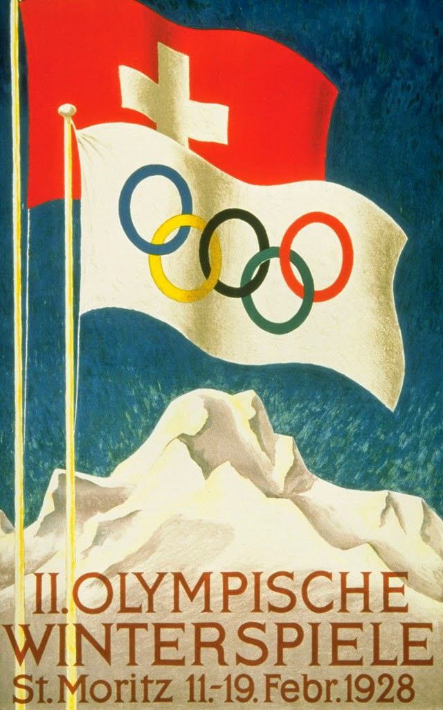
Nowadays, a host city’s logo is one of the first things to be revealed, long before the venues are finalized and the stray dogs murdered. That only became a trend in the 1920s and the Olympic rings have featured in most of the logos since then.


Those famous five interlaced rings, by the way, were not always part of the Olympic package. According to the IOC, the Olympic rings were first used in 1913 when Pierre de Coubertin, the father of the modern Olympics, used them at the top of a letter. A year later, Coubertin presented the rings and the Olympic flag to the Olympic Congress in Paris, and the symbols made their official debyt at the 1920 Games in Antwerp, Belgium.
The five rings symbolize the five continents (Antarctica is excluded while North and South America were combined into one American continent) and the six colours of the flag combined the colours of all the flags of the world.

London, U.K. – Summer 1948

Helsinki, Finland – Summer 1952


St. Moritz, Switzerland – Winter 1928.


Los Angeles, California, USA – Winter 1932


London 2012


Sochi Games 2014


Youtube Link https://www.youtube.com/watch?v=q9sQJc4w6r4


Views on the London 2012 Logo/ Analysis


The jagged emblem, based on the date 2012, comes in a series of shades of pink, blue, green and orange and will evolve in the run-up to the Games.

The word London and the Olympic rings are included in the first two digits of the new logo.

"This is the vision at the very heart of our brand," said London 2012 organising committee chairman Seb Coe.


what's not so good about the London logo?
To me its great but if i had to change a few things the shape is a tad harsh may be round the edges.


My first Solidworks Designs/ Initial ideas 


Medal Design is all about encompassing the countries historical roots and heritage. Brazil and Rio are famous for its long sandy beaches and tropical conditions, but historically hundreds of years ago Amazonian s founded the country. The country is fairly new compared to the UK lets say.
authors own- development of Olympic Medal done on solid works
These designs are ones I created in around 10 to 15 minutes, these are no  way the finished product but are the starting blocks to what colours and materials I aim to use in my medal.
Authors own- Olympic medal development done on solid works

Solid-works is the main software I'm using to create these, I could be modelling them out of paper but this wouldn't show the scale needed, plus the software comes with great rendering techniques.

Things to improve?
Make the medal different from past medals this one looks like Sochis medal because of the use of cut outs.


Authors own - More Development 
The second set of medals created are ones inspired by Rios ever growing population. The soil is fertile which is good for crops in parts of Brazil and in any city people come for work. This medal is fine art based as it gives a statement. To me its obvious but to many it will not be. The message depicts that the over populated society in which people live is a continuous spiral upwards.  The medal is a symbolic for the past and future, the left is their present and past and the right is the future with hope growing and getting more powerful.

I got advice on these designs and the main attractive quality was the Olympic rings, they were simple to do on Solid-works so it wouldn't  be a problem making them again.
Authors own - development / olympic medal
It was suggested to me just have the rings saying RIO
out of the rings but keep it black and white for the best overall effect.
I did colour them this time and it suits the colourful display.


RIOS FAVELAS 


http://www.theguardian.com/travel/gallery/2013/nov/04/favelas-rio-de-janeiro-in-pictures
Rios Favelas


Rocinha (Little Farm), Rio’s largest favela, first sprouted in the 1940s, and is now a swarming anthill of narrow alleys, built on the side of a steep hill. Up to 250,000 people live in Rocinha, most of them in shacks.

In many ways, the favela is the heartbeat of Brazil’s cities, a hotbed of musical talent, and the home of many of its most creative residents. The cultural input of the favela is rarely acknowledged. In fact, theCarnival would not exist if it were not for these communities as many of the main samba schools come from or are named after Rio’s favelas.
http://unionjackcreative.com/blog/2010/06/24/favela-painting/
Rio art Favelas

Life in Rio's favelas


Around 70 percent of the people who live in Rocinha are from the impoverished northeast of Brazil. Often a family of six will live in one or two rooms with one bed for the adults and the children sleeping on the floor. Life expectancy is low – just 48 years, compared with to the national average of 68 years. Illnesses such as bronchitis are common, and although medical care is available at no cost.


Making week.


Viewing Orbit / olympic plattform\


Authors own- Favelas in Rio/ abstract view


favela tower - Authors own


Favelas are often made out of natural materials found and sourced locally, however they are not enough to protect those most vulnerable. I made the top shelter during the making week, it was an instinct make meaning I just stuck things together. Sometimes this is the best way forward as it allows freedom and creativity. The second picture is my second instillation, I made several favela like structures.


The colourful page was another instinct draw and make, what it visibly noticeable is the amount of art and design drawn on to the shelters, they are also very colourful and from a distance make the sight of thousands of these living sites spectacular.


abstract version of Rio's Favela's 


RED YELLOW AND GREEN

Brazil's colours very much are the peoples pride and joy, playing around with colours is the best way to experiment and I did this tile effect twice. Making things out of red, yellow and green paper let me explore the qualities of paper folding.

Rio's carnivals are places where these vibrant colours come in to play and some fans are seen on a manikin doll.

I hoped by doing this experimentation it would give me ideas about the colours and textures used in some of my final ideas.
Authors own
Carnival Theme colours/ clothing


Evaluation


What I could of done better on during making week?


Making week was a great time for me to experiment more and really just let go and make things totally out of the blue, I needed to take risks during that week and I feel I dint use that time. May be design something more related to my project. However the viewing platform is something London Olympics have as the Orbit is designed by Anish Kapoor.

Standing 114.5m tall, this extraordinary attraction is the result of a creative collaboration between world-renowned artist Sir Anish Kapoor, designer Cecil Balmond and ArcelorMittal, the world’s largest steel and mining company. With two observation floors, at 76m and 80m, the ArcelorMittal Orbit provides visitors with stunning views over the Park and across London’s famous skyline. It is both a work of art and a thrilling experience.


What I liked?

Having that freedom to just make and see what happens is rare in the industry, and it helped me having the week to freely explore materials concepts and textures.

What I didn't like?

Being told to just make or draw to some people is easy as its complete freedom but to me its not its more restricting. Apart from this the experience of just purely making was a really good challenge and an enjoyable one in that.

Once Geoff said draw something to do with your project, I freaked out because before I hadn't completed any initial ideas. He then stated whatever you draw make it from the materials in front of you. This is quite a scary thing to process because I had a rough image in my mind but not those materials.