Wednesday, 23 April 2014

Rio Medal Development

Authors own - Solidworks 
Authors own -Solidworks 

From the last model shown which was very colourful it has changed a lot, the other model was more of a fine art piece because  it depicted a moral message. This model not so much I have gone back to basics. The feedback I got from the other development model was that the circles were the best part of the design, so taking that into account I created this one, it states Rio made of out tiny circles cut out, the colour inside gives a nice tint and glow when its turned.

Things I would change?

I would make the letters more bulky and not as little as the rapid prototype might struggle to make these worth while having on he medal.

Any more changes?
The Macaw logo might be ideal to have on the medal

Macaw designs/ development

Authors own- Macaw designs- Mascot

Macaw design 2, Authors own

These are handrawn and water  coloured initial ideas, 


Authors own
Before Laser cutting

Authors own
Laser cutting the Macaw 
I did quite a few drawings of different macaws in several positions in order to get the parrots best angle and to show off its colours and aesthetic beauty. Scanning in was the main method, then laser cutting them. Cardboard and Acrylic was used to cut them out, as different textures it always good. 


Macaw Design - Logo/ Mascot Ideas 

These designs above were drawn and water coloured, the bright colours in the wild are there for beauty and to impress mates. For the actual logo Macaw I want one with the wingspan, this will show off its impressive length and size. 


Authors own
Macaw initial Ideas 

Not just are they stunning to the eye but they have the most delicate markings, and these markings are normally found around the eyes. This is why in my drawing the markings are clearly visible.

My Logo or Mascot being a Macaw was inspired by the climate of Brazil and culture. I didn't want the mascot to be cartoon as they can look fake and tacky, and as these creatures are so extraordinary it needed to be the real thing.
Authors own
Initial Ideas

Authors own
Initial Ideas

Macaws are the largest of all parrots. There are 16 different species of macaws and they range in size from a little over three feet to one foot. They have beautiful, graceful, tails that are as long or longer than their bodies. They also have long, pointed wings that enable them to fly swiftly.Macaws have sharp, hooked bills which are perfect for eating nuts, fruits, and seeds. The beak is strong and is used to break open nut pods. Their feet have a very strong grip which allow them to grasp easily. Two of their toes point forward and two point backward. They can use their foot to grasp food and bring it to their mouth.


Authors own
Edited on Adobe Lightroom

What I'm looking for in a design is the Bird facing away from us with its head turned, and showcasing its tail feathers. Other reasons are:


  1. correct body position
  2. markings 
  3. body shape
  4. beak and plumage 


Adobe Light-room 

 Adobe Lightroom allowed me to make this above this is my development of my mascot  and it will run alongside the 2016 official Logo for Rio.  Fortunately the software allows the colours to be brightened or darkened deepening on what the client wants. In my case the brighter the better.  Steps:


  1. changed the background 
  2. highlights on the animal
  3. fine detailing
  4. feathers texture
  5. hot or cold

Final Logo 

Authors own
Final Macaw Logo


This is my logo not my mascot, it will go along side the logo of the Rio Olympics, I actually drew this out on paper but its so fiddly so I decided to draw it using illustrator. The macaw is actually lots of separate shapes put together and coloured. The image still keeps in mind the beauty and elegance of the Parrot. 

Evaluation 

What went right?

From all the initial ideas created the top 2 images were the most influential because I wanted to keep the mascot as natural as possible, so keeping all its feathers and the detail just because  they're visually beautiful.  

What went wrong?

Spending too much time on the mascot has left me running out of time to make the other products as good as possible.  Therefore I'm having to slightly improvise and get through the  design process a lot quicker than I would of liked too. 

What enjoyed doing?

A mascot is something fun and bright that is very profitable and will sell to the market. I really liked all the editing the textures of the feathers for example, you can zoom in and really edit the grain. Messing around with Adobe Lightroom and other Adobe software make the final product look sharp and defined. 


Tuesday, 22 April 2014

Olympic History

OLYMPIC HISTORY


An Olympic medal from the 1896 Games in Athens, the first Games of the modern era. Things were done a bit different then, the winners received a silver medal and the second place finisher received a bronze medal. Things were even more different in 1900, most winners received cups or trophies instead of medals.

Comparing the more modern medals to this, the first real difference is the graphics, this medal is beautifully finishes and delicate. The newest medals can be seen as a tad tacky compared but this is down to personal opinion. 

Secondly this one on the left has no cut outs the Sochi medal given in Russia in 2014 had half cut out which did look good.


Who designed the London 2012 medals?

The London 2012 Olympic medals have been designed by artist David Watkins come through a six-way Locog tender with his design which casts the Wolff Olins Olympics logo with a set of other symbols.

http://www.designweek.co.uk/analysis/london-2012-design-icons-the-olympic-medals/3034981.article
The medals, are the prize and the glory, the tangible memento, and as such, the ultimate Olympic design icon.


http://www.theguardian.com/sport/blog/2009/oct/09/golf-rugby-sevens-olympics-2016


Logos through time


http://worksdesigngroup.com/tag/olympics/
From the first modern Games in Athens in 1896, which sought to recapture the spirit of the Ancient Greek Olympics, to the 2008

Beijing Games, which announced China’s transition to a superpower, the Olympics have always been steeped in symbolism.


Nowadays, a host city’s logo is one of the first things to be revealed, long before the venues are finalized and the stray dogs murdered. That only became a trend in the 1920s and the Olympic rings have featured in most of the logos since then.


Those famous five interlaced rings, by the way, were not always part of the Olympic package. According to the IOC, the Olympic rings were first used in 1913 when Pierre de Coubertin, the father of the modern Olympics, used them at the top of a letter. A year later, Coubertin presented the rings and the Olympic flag to the Olympic Congress in Paris, and the symbols made their official debyt at the 1920 Games in Antwerp, Belgium.
The five rings symbolize the five continents (Antarctica is excluded while North and South America were combined into one American continent) and the six colours of the flag combined the colours of all the flags of the world.

London, U.K. – Summer 1948

Helsinki, Finland – Summer 1952


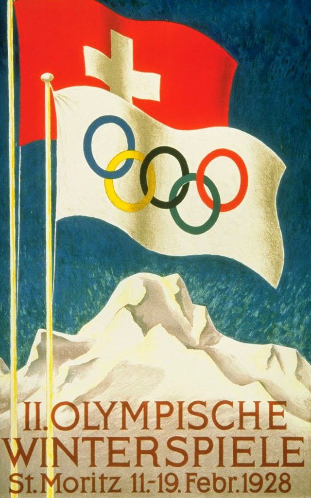
St. Moritz, Switzerland – Winter 1928.


Los Angeles, California, USA – Winter 1932


London 2012


Sochi Games 2014


Youtube Link https://www.youtube.com/watch?v=q9sQJc4w6r4


Views on the London 2012 Logo/ Analysis


The jagged emblem, based on the date 2012, comes in a series of shades of pink, blue, green and orange and will evolve in the run-up to the Games.

The word London and the Olympic rings are included in the first two digits of the new logo.

"This is the vision at the very heart of our brand," said London 2012 organising committee chairman Seb Coe.


what's not so good about the London logo?
To me its great but if i had to change a few things the shape is a tad harsh may be round the edges.


My first Solidworks Designs/ Initial ideas 


Medal Design is all about encompassing the countries historical roots and heritage. Brazil and Rio are famous for its long sandy beaches and tropical conditions, but historically hundreds of years ago Amazonian s founded the country. The country is fairly new compared to the UK lets say.
authors own- development of Olympic Medal done on solid works
These designs are ones I created in around 10 to 15 minutes, these are no  way the finished product but are the starting blocks to what colours and materials I aim to use in my medal.
Authors own- Olympic medal development done on solid works

Solid-works is the main software I'm using to create these, I could be modelling them out of paper but this wouldn't show the scale needed, plus the software comes with great rendering techniques.

Things to improve?
Make the medal different from past medals this one looks like Sochis medal because of the use of cut outs.


Authors own - More Development 
The second set of medals created are ones inspired by Rios ever growing population. The soil is fertile which is good for crops in parts of Brazil and in any city people come for work. This medal is fine art based as it gives a statement. To me its obvious but to many it will not be. The message depicts that the over populated society in which people live is a continuous spiral upwards.  The medal is a symbolic for the past and future, the left is their present and past and the right is the future with hope growing and getting more powerful.

I got advice on these designs and the main attractive quality was the Olympic rings, they were simple to do on Solid-works so it wouldn't  be a problem making them again.
Authors own - development / olympic medal
It was suggested to me just have the rings saying RIO
out of the rings but keep it black and white for the best overall effect.
I did colour them this time and it suits the colourful display.


RIOS FAVELAS 


http://www.theguardian.com/travel/gallery/2013/nov/04/favelas-rio-de-janeiro-in-pictures
Rios Favelas


Rocinha (Little Farm), Rio’s largest favela, first sprouted in the 1940s, and is now a swarming anthill of narrow alleys, built on the side of a steep hill. Up to 250,000 people live in Rocinha, most of them in shacks.

In many ways, the favela is the heartbeat of Brazil’s cities, a hotbed of musical talent, and the home of many of its most creative residents. The cultural input of the favela is rarely acknowledged. In fact, theCarnival would not exist if it were not for these communities as many of the main samba schools come from or are named after Rio’s favelas.
http://unionjackcreative.com/blog/2010/06/24/favela-painting/
Rio art Favelas

Life in Rio's favelas


Around 70 percent of the people who live in Rocinha are from the impoverished northeast of Brazil. Often a family of six will live in one or two rooms with one bed for the adults and the children sleeping on the floor. Life expectancy is low – just 48 years, compared with to the national average of 68 years. Illnesses such as bronchitis are common, and although medical care is available at no cost.


Making week.


Viewing Orbit / olympic plattform\


Authors own- Favelas in Rio/ abstract view


favela tower - Authors own


Favelas are often made out of natural materials found and sourced locally, however they are not enough to protect those most vulnerable. I made the top shelter during the making week, it was an instinct make meaning I just stuck things together. Sometimes this is the best way forward as it allows freedom and creativity. The second picture is my second instillation, I made several favela like structures.


The colourful page was another instinct draw and make, what it visibly noticeable is the amount of art and design drawn on to the shelters, they are also very colourful and from a distance make the sight of thousands of these living sites spectacular.


abstract version of Rio's Favela's 


RED YELLOW AND GREEN

Brazil's colours very much are the peoples pride and joy, playing around with colours is the best way to experiment and I did this tile effect twice. Making things out of red, yellow and green paper let me explore the qualities of paper folding.

Rio's carnivals are places where these vibrant colours come in to play and some fans are seen on a manikin doll.

I hoped by doing this experimentation it would give me ideas about the colours and textures used in some of my final ideas.
Authors own
Carnival Theme colours/ clothing


Evaluation


What I could of done better on during making week?


Making week was a great time for me to experiment more and really just let go and make things totally out of the blue, I needed to take risks during that week and I feel I dint use that time. May be design something more related to my project. However the viewing platform is something London Olympics have as the Orbit is designed by Anish Kapoor.

Standing 114.5m tall, this extraordinary attraction is the result of a creative collaboration between world-renowned artist Sir Anish Kapoor, designer Cecil Balmond and ArcelorMittal, the world’s largest steel and mining company. With two observation floors, at 76m and 80m, the ArcelorMittal Orbit provides visitors with stunning views over the Park and across London’s famous skyline. It is both a work of art and a thrilling experience.


What I liked?

Having that freedom to just make and see what happens is rare in the industry, and it helped me having the week to freely explore materials concepts and textures.

What I didn't like?

Being told to just make or draw to some people is easy as its complete freedom but to me its not its more restricting. Apart from this the experience of just purely making was a really good challenge and an enjoyable one in that.

Once Geoff said draw something to do with your project, I freaked out because before I hadn't completed any initial ideas. He then stated whatever you draw make it from the materials in front of you. This is quite a scary thing to process because I had a rough image in my mind but not those materials.


Tuesday, 15 April 2014

Polar Bear - Sochi 2014 Mascot Video

Olympic Mascots

http://russiatrek.org/sochi2014


Olympic mascots and Designs


There were many incredible sights and sounds during the 2014 opening ceremony in Sochi. Some of the biggest and most talked about spectacles were the olympic mascots.

Organisers of Sochi's opening ceremony decided to use three giant, stuffed animal like mascots, featuring a polar bear; a leopard and a hare. Some mascots in years past were a little too over the top; the ones used in Sochi looked rather inviting.


http://www.archilovers.com/s1214/a-little-history-of-olympic-mascots
The Olympic mascots are fictional characters usually an animal native to the area or human figures, who represent the cultural heritage of the place where the Olympic and Paralympic games are taking place. The mascots are often used to help market the Olympic Games to a younger audience, in particular children.

Since the 1968 Winter Olympics in Grenoble, France the Olympic Games have had a mascot. The first major mascot in the Summer Olympic Games was Misha in the 1980 summer Olympics in Moscow.


Alice and Wonderland Mascot Inspiration 

Authors own
the cat 
Authors own
Macaw Initial ideas

Alice in Wonderland the film and book is a great story just because of its recognisable characters such as:


  • The mad hatter
  • the white rabbit
  • the queen of hearts
  • chesire cat
  • the caterpillar
  • Jabberwocky

Authors own random character design 

Authors own
character Design 

Character Design
Authors own
  • What mascots need to be in order to be successful ?


  • fun
  • attractive
  • bright
  • engaging
  • iconic
  • can be made into a toy
  • cute
  • smiley
  • nice size and shape etc
  • Designing mascots isn't an easy process as there are loads of things to take into consideration but I plan on linking all three elements, the torch, flame and mascot. 


Evaluation 

What went well?

The research stage for me went well just because I was able to use my previous knowledge and experience with mascots to help me. The research to what mascots are comes with many different types of media i.e. blogs, youtube, google, books and journals. Therefore I was able to see what exits and what gap I need to aim for to make my  design successful. 


Authors own
Berlin stadium 
Berlin

Berlin I feel was a tipping point of the course, going opened up my eyes to the art and culture Germany has to offer. During the stay visiting the olympic stadium was something i wanted to do, as my project involves sport and the history of where sport came from. The berlin games in  1936 still has a dark cloud hanging over it due to the dominance of the gestapo and party in charge.
Authors own  Berlin Bear 
The stadium held 100,000 spectators, 75 new olympic buildings including the Olympic pool. The games had been handed to Berlin before the Nazis came to power but it was now a perfect opportunity for Hitler to demonstrate to the world how efficient Nazi Germany had become.


Buddy Bear this was the Olympic Mascot what was striking was the amount of different patterns as seen on the left picture. I can imagine the bears being good commercially, and that they relate to many people.


Olympic Stadium 
Authors own
stadium 


Authors own
Berlin stadium this seemed haunted because of the lettering.


An Olympic medal is awarded to successful competitors at the Olympic Games. There are three classes of medal: gold awarded to the winner; silver awarded to the 1st runner-up; and bronze awarded to the 2nd runner-up. The granting of awards is laid out in detail in the Olympic protocolsMedal designs have varied considerably since the first Olympic Games in 1896, particularly in size and weight. The Sochi medals are a good example of how much Olympic designs have changed nowadays they are much heavier, 3d as well as 2d, have cut out sections and are again much larger.
Authors own - initial ideas

Initial Ideas- Authors own 

Initial Ideas:
These are my initial ideas for medal designs, obviously they are similar to the medals given out at Sochi but medal designs are all increasing in size and have more detail than before.  The medals represent Brazil and their culture the statue of God is an icon in Rio, the Olympic rings representing togetherness of a nation and all the countries taking part.


  • During my initial ideas I started thinking about the consequences of the Olympics in Rio , the games provide money and a boost in tourism but there are many bad things the games will bring to a community. 
  • Guards and police clashes
  • keeping the structures used after the games/expenses
  • getting people into sport and funding
  • Riots
  • terrorism 
For some, the Games are a huge waste of public money. Originally estimated at a cost of £2.4bn, the budget had by 2007 ballooned to £9.3bn. Now that it looks likely to come in at just over £9.2b. 


Authors own - Initial Ideas

Initial Ideas Initial Ideas


Initial Ideas - Authors own